
FROM THE WORKBENCH OF THE MADE COZY STUDIO:
A COZY THINGS NEWSLETTER
April 22, 2024
Hello from the Made Cozy Studios and welcome to our late April Newsletter!
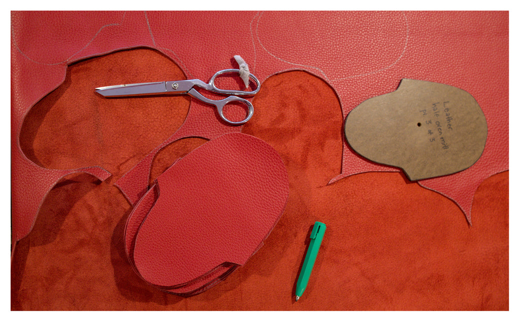
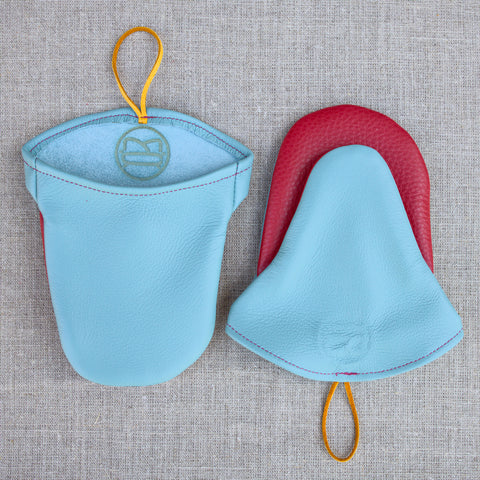
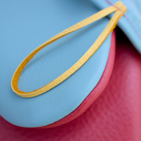
Surprise, we just launched our newest Oven Mitt color in Poppy red and Sea Foam blue-green! Our oven mitts are by far our best sellers and the products that we see the most repeat customers with. (They make great gifts and it's grilling season!)
 |
 |
Later this season we will have a waffle fabric pillow and a pocket sized toy bear in fabrics inspired by the same color pallet. This color pallet is repeated throughout our home so I thought it was a good time to share some thoughts on it as we ramp up to launching these new pieces:
We love bold colors in our house! Bright primary colors mixed with natural tones and textures. Maybe this color pallet is a soft take on the De Stijl art I'm drawn to. De Stijl art, for the uninitiated, is full of primary colors, geometric shapes and plays with the relationship of positive and negative space. I often feel like I have a love-hate relationship with De Stijl art: I'm drawn to bold bright colors, but dislike the seemingly intentional discomfort of lots of de stijl furniture. (The famous Gerrit Reitveld chair is a good example). Visually, it is quite inorganic and meant to be a return to simplicity and fundamentals.
I like the idea of bringing a little natural back into these simple ideas because life can't be as simple as primary colors. I like combining a bright primary red with a blue that's been softened and is now a bit green. Or including a yellow that has been muddied with a little bit of brown.

This year I have been focused using all natural materials and I have been struck by how all natural materials have a natural variability in them: some wool stuffing might have more grass and a knottier texture than others. Some wood boards twist, and warp, and cup after planing. Learning that every product needs a little individual care and attention to create something truly well made has been an important lesson this year. I think this color pallet reflects that. There is order and simplicity in primary colors, but I also want to take notice of the chaos, imperfection, and variability of nature.
Some on theme inspiration:
1. The art of Emily Forgot: her series Interplay plays with familiar de stijl shapes and limited colors but adds curves and antiqued natural tones.
2. White Stripes De Stijl album: Maybe my first favorite album (The Beatles albums excluded). I still listen to this one regularly
3. 99% invisible episode: The Many Deaths of a Painting: We love this podcast about how society interacts with art and design. This episode is on theme for this newsletter on de stijl color pallets about the painting Who’s Afraid of Red Yellow and Blue III.
4. More to come: The 3rd prototype of a Tea Shelf we've been designing since last fall is finished and so so close to where we want it to be. We tweaked a couple small things about the design and picked up wood for the next (possibly final) prototype.
We have a couple of other woodworking projects on the books for this season and if you have a project in mind, please reach out! We love customizing our designs to fit your home.
All the best,
Haviland Justice
Made Cozy